怎么在Python中使用matplotlib和pandas實(shí)現(xiàn)畫圖-創(chuàng)新互聯(lián)
本篇文章給大家分享的是有關(guān)怎么在Python中使用matplotlib和pandas實(shí)現(xiàn)畫圖,小編覺得挺實(shí)用的,因此分享給大家學(xué)習(xí),希望大家閱讀完這篇文章后可以有所收獲,話不多說,跟著小編一起來看看吧。

#encoding:utf-8
'''''
Created on 2015年9月11日
@author: ZHOUMEIXU204
'''
# pylab 是 matplotlib 面向?qū)ο罄L圖庫的一個(gè)接口。它的語法和 Matlab 十分相近
import pandas as pd
#from ggplot import *
import numpy as np
import matplotlib.pyplot as plt
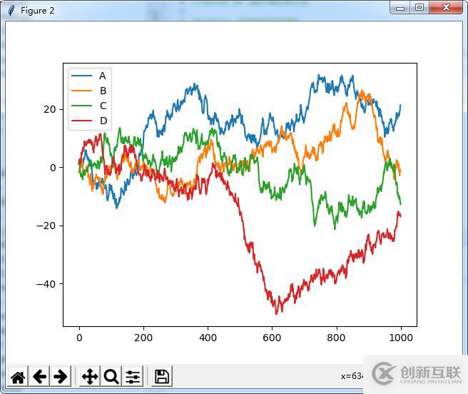
df=pd.DataFrame(np.random.randn(1000,4),columns=list('ABCD'))
df=df.cumsum()
print(plt.figure())
print(df.plot())
print(plt.show())
# print(ggplot(df,aes(x='A',y='B'))+geom_point())運(yùn)行效果:
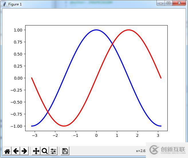
# 畫簡單的圖形
from pylab import *
x=np.linspace(-np.pi,np.pi,256,endpoint=True)
c,s=np.cos(x),np.sin(x)
plot(x,c, color="blue", linewidth=2.5, line, label="cosine") #label用于標(biāo)簽顯示問題
plot(x,s,color="red", linewidth=2.5, line, label="sine")
show()
運(yùn)行效果:
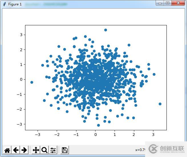
#散點(diǎn)圖
from pylab import *
n = 1024
X = np.random.normal(0,1,n)
Y = np.random.normal(0,1,n)
scatter(X,Y)
show()
運(yùn)行效果:
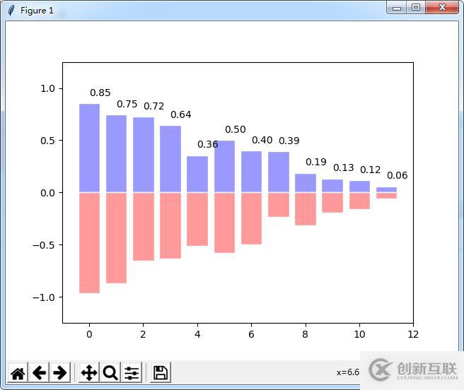
#條形圖
from pylab import *
n = 12
X = np.arange(n)
Y1 = (1-X/float(n)) * np.random.uniform(0.5,1.0,n)
Y2 = (1-X/float(n)) * np.random.uniform(0.5,1.0,n)
bar(X, +Y1, facecolor='#9999ff', edgecolor='white')
bar(X, -Y2, facecolor='#ff9999', edgecolor='white')
for x,y in zip(X,Y1):
 text(x+0.4, y+0.05, '%.2f' % y, ha='center', va= 'bottom')
ylim(-1.25,+1.25)
show()
運(yùn)行效果:
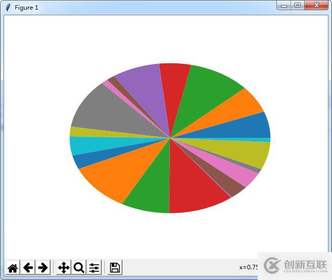
#餅圖
from pylab import *
n = 20
Z = np.random.uniform(0,1,n)
pie(Z), show()
運(yùn)行效果:
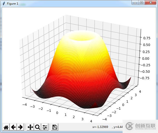
#畫三維圖
import numpy as np
from mpl_toolkits.mplot3d import Axes3D
from pylab import *
fig=figure()
ax=Axes3D(fig)
x=np.arange(-4,4,0.1)
y=np.arange(-4,4,0.1)
x,y=np.meshgrid(x,y)
R=np.sqrt(x**2+y**2)
z=np.sin(R)
ax.plot_surface(x,y,z,rstride=1,cstride=1,cmap='hot')
show()
運(yùn)行效果:
#用于圖像顯示的問題
import matplotlib.pyplot as plt
import pandas as pd
weights_dataframe=pd.DataFrame()
plt.figure()
plt.plot(weights_dataframe.weights_ij,weights_dataframe.weights_x1,label='weights_x1')
plt.plot(weights_dataframe.weights_ij,weights_dataframe.weights_x0,label='weights_x0')
plt.plot(weights_dataframe.weights_ij,weights_dataframe.weights_x2,label='weights_x2')
plt.legend(loc='upper right') #用于標(biāo)簽顯示問題
plt.xlabel(u"迭代次數(shù)", fontproperties='SimHei')
plt.ylabel(u"參數(shù)變化", fontproperties='SimHei')
plt.title(u"迭代次數(shù)顯示", fontproperties='SimHei') #fontproperties='SimHei' 用于可以顯示中文
plt.show()
import matplotlib.pyplot as plt
from numpy.random import random
colors = ['b', 'c', 'y', 'm', 'r']
lo = plt.scatter(random(10), random(10), marker='x', color=colors[0])
ll = plt.scatter(random(10), random(10), marker='o', color=colors[0])
l = plt.scatter(random(10), random(10), marker='o', color=colors[1])
a = plt.scatter(random(10), random(10), marker='o', color=colors[2])
h = plt.scatter(random(10), random(10), marker='o', color=colors[3])
hh = plt.scatter(random(10), random(10), marker='o', color=colors[4])
ho = plt.scatter(random(10), random(10), marker='x', color=colors[4])
plt.legend((lo, ll, l, a, h, hh, ho),
   ('Low Outlier', 'LoLo', 'Lo', 'Average', 'Hi', 'HiHi', 'High Outlier'),
   scatterpoints=1,
   loc='lower left',
   ncol=3,
   fontsize=8)
plt.show()
#pandas中畫圖
#畫累和圖
import pandas as pd
import numpy as np
import matplotlib.pyplot as plt
ts=pd.Series(np.random.randn(1000),index=pd.date_range('1/1/2000',periods=1000))
ts=ts.cumsum()
ts.plot()
plt.show()
df=pd.DataFrame(np.random.randn(1000,4),index=ts.index,columns=list('ABCD'))
df=df.cumsum()
df.plot()
plt.show()import pandas as pd
import numpy as np
import matplotlib.pyplot as plt
#畫柱狀圖
df2 = pd.DataFrame(np.random.rand(10, 4), columns=['a', 'b', 'c', 'd'])
df2.plot(kind='bar') #分開并列線束
df2.plot(kind='bar', stacked=True) #四個(gè)在同一個(gè)里面顯示 百分比的形式
df2.plot(kind='barh', stacked=True)#縱向顯示
plt.show()
df4=pd.DataFrame({'a':np.random.randn(1000)+1,'b':np.random.randn(1000),'c':np.random.randn(1000)-1},columns=list('abc'))
df4.plot(kind='hist', alpha=0.5)
df4.plot(kind='hist', stacked=True, bins=20)
df4['a'].plot(kind='hist', orientation='horizontal',cumulative=True) #cumulative是按順序排序,加上這個(gè)
plt.show()
#Area Plot
df = pd.DataFrame(np.random.rand(10, 4), columns=['a', 'b', 'c', 'd'])
df.plot(kind='area')
df.plot(kind='area',stacked=False)
plt.show()#散點(diǎn)圖 import pandas as pd import numpy as np import matplotlib.pyplot as plt df = pd.DataFrame(np.random.rand(50, 4), columns=['a', 'b', 'c', 'd']) df.plot(kind='scatter', x='a', y='b') df.plot(kind='scatter', x='a', y='b',color='DarkBlue', label='Group 1') #餅圖 df = pd.DataFrame(3 * np.random.rand(4, 2), index=['a', 'b', 'c', 'd'], columns=['x', 'y']) df.plot(kind='pie', subplots=True, figsize=(8, 4)) df.plot(kind='pie', subplots=True,autopct='%.2f',figsize=(8, 4)) #顯示百分比 plt.show() #畫矩陣散點(diǎn)圖 df = pd.DataFrame(np.random.randn(1000, 4), columns=['a', 'b', 'c', 'd']) pd.scatter_matrix(df, alpha=0.2, figsize=(6, 6), diagonal='kde') plt.show()
以上就是怎么在Python中使用matplotlib和pandas實(shí)現(xiàn)畫圖,小編相信有部分知識點(diǎn)可能是我們?nèi)粘9ぷ鲿姷交蛴玫降摹OM隳芡ㄟ^這篇文章學(xué)到更多知識。更多詳情敬請關(guān)注創(chuàng)新互聯(lián)行業(yè)資訊頻道。
網(wǎng)站名稱:怎么在Python中使用matplotlib和pandas實(shí)現(xiàn)畫圖-創(chuàng)新互聯(lián)
文章位置:http://chinadenli.net/article48/dspsep.html
成都網(wǎng)站建設(shè)公司_創(chuàng)新互聯(lián),為您提供網(wǎng)站維護(hù)、全網(wǎng)營銷推廣、營銷型網(wǎng)站建設(shè)、自適應(yīng)網(wǎng)站、網(wǎng)站改版、用戶體驗(yàn)
聲明:本網(wǎng)站發(fā)布的內(nèi)容(圖片、視頻和文字)以用戶投稿、用戶轉(zhuǎn)載內(nèi)容為主,如果涉及侵權(quán)請盡快告知,我們將會在第一時(shí)間刪除。文章觀點(diǎn)不代表本網(wǎng)站立場,如需處理請聯(lián)系客服。電話:028-86922220;郵箱:631063699@qq.com。內(nèi)容未經(jīng)允許不得轉(zhuǎn)載,或轉(zhuǎn)載時(shí)需注明來源: 創(chuàng)新互聯(lián)
猜你還喜歡下面的內(nèi)容
- 什么好是c++萬能頭文件-創(chuàng)新互聯(lián)
- 利用PHP怎么實(shí)現(xiàn)一個(gè)自動加載功能-創(chuàng)新互聯(lián)
- 一個(gè)機(jī)柜一般放多少臺服務(wù)器-創(chuàng)新互聯(lián)
- 移動端WEB開發(fā)中click,touch,tap事件怎么使用-創(chuàng)新互聯(lián)
- ByteBuddy工具的使用場景有哪些?-創(chuàng)新互聯(lián)
- 如何在靜態(tài)頁面html中實(shí)現(xiàn)簡單的查找功能-創(chuàng)新互聯(lián)
- Jquery異步上傳文件代碼實(shí)例-創(chuàng)新互聯(lián)

- 商城網(wǎng)站的建設(shè)規(guī)劃 2016-11-03
- 淺析國內(nèi)三款知名java商城系統(tǒng) 2015-09-04
- 商城類小程序的主要功能有哪些 2016-01-19
- 商城網(wǎng)站制作未來的發(fā)展 2021-10-14
- 商城網(wǎng)站建設(shè)/電商平臺搭建怎么做好? 2013-09-21
- 移動商城網(wǎng)站在建設(shè)時(shí)必須要了解的一些事項(xiàng) 2015-08-17
- “B2C商城網(wǎng)站”建設(shè)功能 2021-02-23
- 商城網(wǎng)站建設(shè)中優(yōu)惠券功能復(fù)雜嗎?收費(fèi)如何? 2023-02-08
- 成都網(wǎng)站建設(shè)之購物商城網(wǎng)站建設(shè)要注意什么? 2016-10-21
- 微商城網(wǎng)站建設(shè)有什么共同特征呢 2021-12-26
- 廣州商城網(wǎng)站建設(shè)的重點(diǎn)是什么? 2022-12-10
- 商城網(wǎng)站建設(shè)需要注意的事項(xiàng) 2016-10-14