使用CSS制作對(duì)話框氣泡的方法-創(chuàng)新互聯(lián)
這篇文章主要介紹使用CSS制作對(duì)話框氣泡的方法,文中介紹的非常詳細(xì),具有一定的參考價(jià)值,感興趣的小伙伴們一定要看完!
創(chuàng)新互聯(lián)是一家集網(wǎng)站建設(shè),湛河企業(yè)網(wǎng)站建設(shè),湛河品牌網(wǎng)站建設(shè),網(wǎng)站定制,湛河網(wǎng)站建設(shè)報(bào)價(jià),網(wǎng)絡(luò)營(yíng)銷,網(wǎng)絡(luò)優(yōu)化,湛河網(wǎng)站推廣為一體的創(chuàng)新建站企業(yè),幫助傳統(tǒng)企業(yè)提升企業(yè)形象加強(qiáng)企業(yè)競(jìng)爭(zhēng)力。可充分滿足這一群體相比中小企業(yè)更為豐富、高端、多元的互聯(lián)網(wǎng)需求。同時(shí)我們時(shí)刻保持專業(yè)、時(shí)尚、前沿,時(shí)刻以成就客戶成長(zhǎng)自我,堅(jiān)持不斷學(xué)習(xí)、思考、沉淀、凈化自己,讓我們?yōu)楦嗟钠髽I(yè)打造出實(shí)用型網(wǎng)站。我們?cè)诤蛣e人通過微信或者qq聊天的時(shí)候都會(huì)有對(duì)話框氣泡,那么這個(gè)對(duì)話框氣泡是怎么實(shí)現(xiàn)的呢?
首先我們來看一下我們需要制作的對(duì)話框的效果
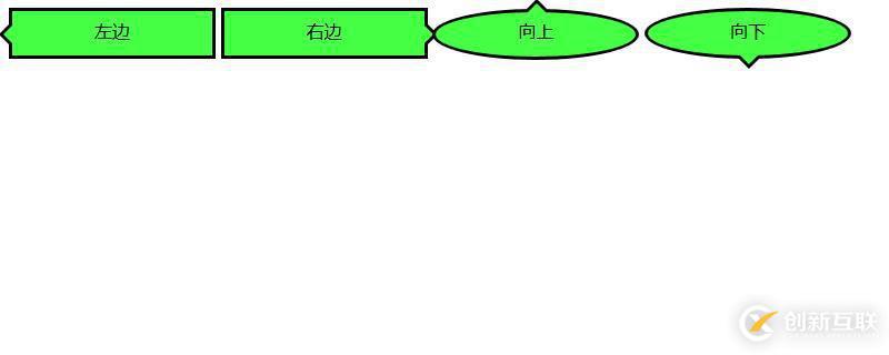
接下來我們就來看看這幾種對(duì)話氣泡的實(shí)現(xiàn)方法
我們來看一下如何實(shí)現(xiàn)箭頭向左的對(duì)話氣泡
我們需要先來制作一個(gè)框架
代碼如下
HTML代碼
<div class="balloon-left">
左邊
</div>
CSS代碼
.balloon-left {
  position: relative;
  display: inline-block;
  padding: 0 15px;
  width: auto;
  min-width: 150px;
  height: 40px;
  line-height: 34px;
  text-align: center;
  background: #44FF44;
  border: 3px solid #000000;
  z-index: 0;
}
接著,我們使用:before來制作箭頭部分,用:after來制作箭頭的邊
CSS代碼
.balloon-left:before {
border-style: solid;
border-width: 10px 10px 10px 0;
border-color: transparent #44FF44 transparent transparent;
content: "";
position: absolute;
top: 50%; left: -8px;
margin-top: -9px;
display: block;
width: 0px;
height: 0px;
z-index: 0;
}
.balloon-left:after {
border-style: solid;
border-width: 11px 11px 11px 0;
border-color: transparent #000000 transparent transparent;
content: "";
position: absolute;
top: 50%; left: -12px;
margin-top: -10px;
display: block;
width: 0px;
height: 0px;
z-index: -1;
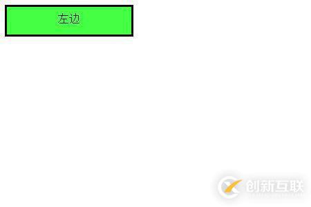
}運(yùn)行效果入下所示
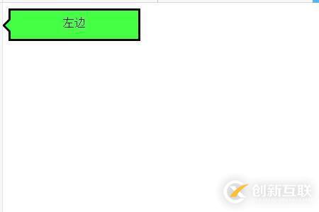
這樣就完成了第一個(gè)對(duì)話氣泡
下面我們就來根據(jù)上述方法來制作箭頭向右的對(duì)話氣泡
代碼如下
HTML代碼
<div class="balloon-right">
  右邊
</div>
CSS代碼
.balloon-right {
position: relative;
display: inline-block;
padding: 0 15px;
width: auto;
min-width: 150px;
height: 40px;
line-height: 34px;
text-align: center;
background: #44FF44;
border: 3px solid #000000;
z-index: 0;
}
.balloon-right:before {
border-style: solid;
border-width: 10px 0 10px 10px;
border-color: transparent transparent transparent #44FF44;
content: "";
position: absolute;
top: 50%; right: -8px;
margin-top: -9px;
display: block;
width: 0px;
height: 0px;
z-index: 0;
}
.balloon-right:after {
border-style: solid;
border-width: 11px 0 11px 11px;
border-color: transparent transparent transparent #000000;
content: "";
position: absolute;
top: 50%; right: -12px;
margin-top: -10px;
display: block;
width: 0px;
height: 0px;
z-index: -1;
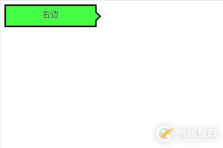
}運(yùn)行上述代碼的效果如下所示:是一個(gè)向右的氣泡
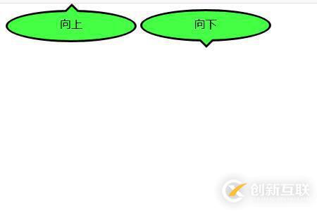
最后我們來說箭頭向左和向右的對(duì)話氣泡
我們需要用到border-radius屬性讓氣泡變得圓滑
代碼如下
HTML代碼
<div class="balloon-top">向上</div>
  <div class="balloon-bottom">向下</div>
CSS代碼
.balloon-top {
  position: relative;
  display: inline-block;
  padding: 0 15px;
  width: auto;
  min-width: 150px;
  height: 40px;
  line-height: 32px;
  text-align: center;
  background: #44FF44;
  border: 3px solid #000000;
  z-index: 0;
  border-radius: 60%;
}
.balloon-top:before {
  border-style: solid;
  border-width: 0 10px 10px 10px;
  border-color: transparent transparent #44FF44 transparent;
  content: "";
  position: absolute;
  top: -8px; left: 50%;
  margin-left: -9px;
  display: block;
  width: 0px;
  height: 0px;
  z-index: 0;
}
.balloon-top:after {
  border-style: solid;
  border-width: 0 11px 11px 11px;
  border-color: transparent transparent #000000 transparent;
  content: "";
  position: absolute;
  top: -12px; left: 50%;
  margin-left: -10px;
  display: block;
  width: 0px;
  height: 0px;
  z-index: -1;
}
.balloon-bottom {
  position: relative;
  display: inline-block;
  padding: 0 15px;
  width: auto;
  min-width: 150px;
  height: 40px;
  line-height: 34px;
  text-align: center;
  background-color: #44FF44;
  border: 3px solid #000000;
  z-index: 0;
  border-radius: 60%;
}
.balloon-bottom:before {
  content: "";
  position: absolute;
  bottom: -8px; left: 50%;
  margin-left: -9px;
  width: 0px;
  height: 0px;
  border-style: solid;
  border-width: 10px 10px 0 10px;
  border-color: #44FF44 transparent transparent transparent;
  z-index: 0;
}
.balloon-bottom:after {
  border-style: solid;
  border-width: 11px 11px 0 11px;
  border-color: #000000 transparent transparent transparent;
  content: "";
  position: absolute;
  bottom: -12px; left: 50%;
  margin-left: -10px;
  width: 0px;
  height: 0px;
  z-index: -1;
}
效果如下所示
CSS部分有點(diǎn)復(fù)雜,但你可以根據(jù)以上示例通過自定義顏色和形狀來制作各種類型的對(duì)話框氣泡。
以上是使用CSS制作對(duì)話框氣泡的方法的所有內(nèi)容,感謝各位的閱讀!希望分享的內(nèi)容對(duì)大家有幫助,更多相關(guān)知識(shí),歡迎關(guān)注創(chuàng)新互聯(lián)網(wǎng)站制作公司行業(yè)資訊頻道!
本文標(biāo)題:使用CSS制作對(duì)話框氣泡的方法-創(chuàng)新互聯(lián)
文章起源:http://chinadenli.net/article44/cejehe.html
成都網(wǎng)站建設(shè)公司_創(chuàng)新互聯(lián),為您提供商城網(wǎng)站、標(biāo)簽優(yōu)化、搜索引擎優(yōu)化、云服務(wù)器、網(wǎng)站營(yíng)銷、外貿(mào)建站
聲明:本網(wǎng)站發(fā)布的內(nèi)容(圖片、視頻和文字)以用戶投稿、用戶轉(zhuǎn)載內(nèi)容為主,如果涉及侵權(quán)請(qǐng)盡快告知,我們將會(huì)在第一時(shí)間刪除。文章觀點(diǎn)不代表本網(wǎng)站立場(chǎng),如需處理請(qǐng)聯(lián)系客服。電話:028-86922220;郵箱:631063699@qq.com。內(nèi)容未經(jīng)允許不得轉(zhuǎn)載,或轉(zhuǎn)載時(shí)需注明來源: 創(chuàng)新互聯(lián)
猜你還喜歡下面的內(nèi)容
- C#表達(dá)式目錄樹的應(yīng)用詳解-創(chuàng)新互聯(lián)
- go語(yǔ)言代碼加密的方法-創(chuàng)新互聯(lián)
- 虛擬主機(jī)和數(shù)據(jù)庫(kù)的區(qū)別是什么-創(chuàng)新互聯(lián)
- TweenAnimation與FrameAnimation的使用方法-創(chuàng)新互聯(lián)
- 怎樣進(jìn)行SQLServer的有效安裝-創(chuàng)新互聯(lián)
- Hadoop如何運(yùn)行在Kubernetes平臺(tái)-創(chuàng)新互聯(lián)
- Linux服務(wù)器有哪些優(yōu)勢(shì)-創(chuàng)新互聯(lián)

- 網(wǎng)站建設(shè)時(shí)注冊(cè)域名的注意事項(xiàng) 2014-05-29
- 如何保護(hù)注冊(cè)域名?保護(hù)域名不被別人搶注 2017-03-10
- 注冊(cè)域名這種常見問題要了解 2016-11-14
- 域名注冊(cè)中的常見問題 2022-11-16
- 從事網(wǎng)站建設(shè)十年后再談?dòng)蛎?cè)需要做的準(zhǔn)備工作 2022-05-15
- 制作營(yíng)銷型網(wǎng)站時(shí)注冊(cè)域名有哪些注意事項(xiàng) 2016-09-06
- 網(wǎng)站建設(shè)中的域名注冊(cè)常識(shí) 2016-11-06
- 新注冊(cè)域名被盜怎么辦?新手要掌握哪些防盜方法? 2016-10-25
- 企業(yè)網(wǎng)站制作搶先注冊(cè)域名很有必要 2016-09-01
- 注冊(cè)域名會(huì)遇到哪些問題?如何域名注冊(cè)? 2021-02-26
- 佛山網(wǎng)站制作中域名注冊(cè)的問題 2022-11-30
- GOV.CN域名注冊(cè)注意事項(xiàng) 2015-04-18