css如何制作超萌吃豆豆加載動畫效果-創(chuàng)新互聯(lián)
這篇文章給大家分享的是有關(guān)css如何制作超萌吃豆豆加載動畫效果的內(nèi)容。小編覺得挺實用的,因此分享給大家做個參考,一起跟隨小編過來看看吧。

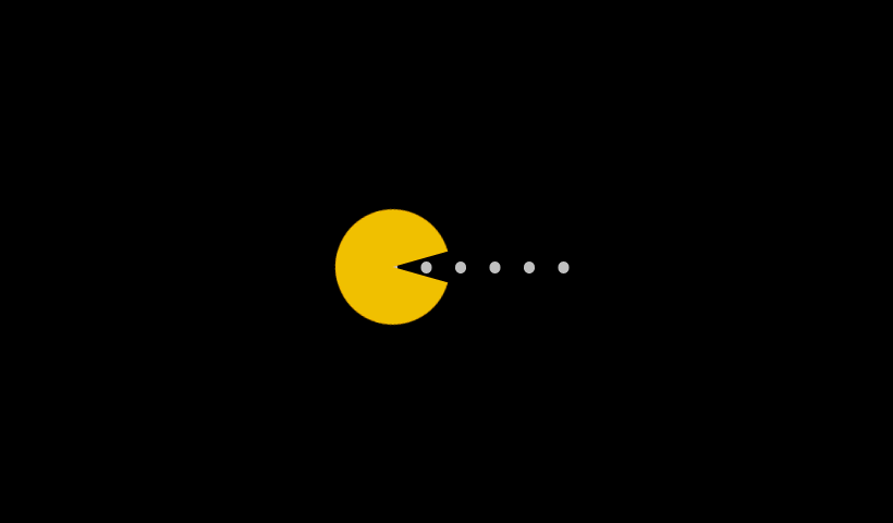
豆豆加載效果
point_down:html代碼:
<div class="demo">
 <div class="pacman"></div>
<div class="dot"></div>
point_down:css代碼:
<style>
@-webkit-keyframes up {
  0%, 100% {    transform: rotate(0);
  }
  50% {
    transform: rotate(-30deg);
  }
}
@-moz-keyframes up {
  0%, 100% {
    transform: rotate(0);
  }
  50% {
    transform: rotate(-30deg);
  }
}
@-o-keyframes up {
  0%, 100% {
    transform: rotate(0);
  }
  50% {
    transform: rotate(-30deg);
  }
}
@keyframes up {
  0%, 100% {
    transform: rotate(0);
  }
  50% {
    transform: rotate(-30deg);
  }
}
@-webkit-keyframes down {
  0%, 100% {
    transform: rotate(0);
  }
  50% {
    transform: rotate(30deg);
  }
}
@-moz-keyframes down {
  0%, 100% {
    transform: rotate(0);
  }
  50% {
    transform: rotate(30deg);
  }
}
@-o-keyframes down {
  0%, 100% {
    transform: rotate(0);
  }
  50% {
    transform: rotate(30deg);
  }
}
@keyframes down {
  0%, 100% {
    transform: rotate(0);
  }
  50% {
    transform: rotate(30deg);
  }
}
@-webkit-keyframes r-to-l {
  100% {
    margin-left: -1px;
  }
}
@-moz-keyframes r-to-l {
  100% {
    margin-left: -1px;
  }
}
@-o-keyframes r-to-l {
  100% {
    margin-left: -1px;
  }
}
@keyframes r-to-l {
  100% {
    margin-left: -1px;
  }
}
body {
  background: #000;
  overflow: hidden;
  margin: 0;
}
body .pacman:before, body .pacman:after {
  content: '';
  position: absolute;
  background: #FFC107;
  width: 100px;
  height: 50px;
  left: 50%;
  top: 50%;
  margin-left: -50px;
  margin-top: -50px;
  border-radius: 50px 50px 0 0;
  -webkit-animation: up 0.4s infinite;
  -moz-animation: up 0.4s infinite;
  -o-animation: up 0.4s infinite;
  animation: up 0.4s infinite;
}
body .pacman:after {
  margin-top: -1px;
  border-radius: 0 0 50px 50px;
  -webkit-animation: down 0.4s infinite;
  -moz-animation: down 0.4s infinite;
  -o-animation: down 0.4s infinite;
  animation: down 0.4s infinite;
}
body .dot {
  position: absolute;
  left: 50%;
  top: 50%;
  width: 10px;
  height: 10px;
  margin-top: -5px;
  margin-left: 30px;
  border-radius: 50%;
  background: #ccc;
  z-index: -1;
  box-shadow: 30px 0 0 #ccc, 60px 0 0 #ccc, 90px 0 0 #ccc, 120px 0 0 #ccc, 150px 0 0 #ccc;
  -webkit-animation: r-to-l 0.4s infinite;
  -moz-animation: r-to-l 0.4s infinite;
  -o-animation: r-to-l 0.4s infinite;
  animation: r-to-l 0.4s infinite;
}
  </style>
感謝各位的閱讀!關(guān)于“css如何制作超萌吃豆豆加載動畫效果”這篇文章就分享到這里了,希望以上內(nèi)容可以對大家有一定的幫助,讓大家可以學(xué)到更多知識,如果覺得文章不錯,可以把它分享出去讓更多的人看到吧!
網(wǎng)站題目:css如何制作超萌吃豆豆加載動畫效果-創(chuàng)新互聯(lián)
URL網(wǎng)址:http://chinadenli.net/article30/dioepo.html
成都網(wǎng)站建設(shè)公司_創(chuàng)新互聯(lián),為您提供靜態(tài)網(wǎng)站、微信小程序、網(wǎng)頁設(shè)計公司、響應(yīng)式網(wǎng)站、Google、企業(yè)建站
聲明:本網(wǎng)站發(fā)布的內(nèi)容(圖片、視頻和文字)以用戶投稿、用戶轉(zhuǎn)載內(nèi)容為主,如果涉及侵權(quán)請盡快告知,我們將會在第一時間刪除。文章觀點不代表本網(wǎng)站立場,如需處理請聯(lián)系客服。電話:028-86922220;郵箱:631063699@qq.com。內(nèi)容未經(jīng)允許不得轉(zhuǎn)載,或轉(zhuǎn)載時需注明來源: 創(chuàng)新互聯(lián)
猜你還喜歡下面的內(nèi)容
- 教你玩轉(zhuǎn)Linux系統(tǒng)目錄結(jié)構(gòu)-創(chuàng)新互聯(lián)
- 在vue.js插圖片的示例-創(chuàng)新互聯(lián)
- python將回車作為輸入內(nèi)容的實例-創(chuàng)新互聯(lián)
- C++兩種單例(餓漢式,懶漢式)-創(chuàng)新互聯(lián)
- css讓圖片橫著排列的方法-創(chuàng)新互聯(lián)
- MySQL中(JOIN/ORDERBY)語句的查詢過程及優(yōu)化方法-創(chuàng)新互聯(lián)
- web前端入門到實戰(zhàn):HTML-div和span標(biāo)簽-創(chuàng)新互聯(lián)

- 國產(chǎn)手機(jī)操作系統(tǒng)的另類路徑:微信等超級APP越做越“大” 2016-08-26
- 手機(jī)網(wǎng)站建站哪些事項需要重點關(guān)注 2016-11-16
- 手機(jī)網(wǎng)站建設(shè)需要遵循哪些常見的原則? 2022-05-25
- 成都手機(jī)網(wǎng)站建設(shè)公司用數(shù)據(jù)說明移動友好型網(wǎng)站的重要性 2023-03-20
- 不做彈窗的手機(jī)網(wǎng)站建設(shè)應(yīng)注意什么 2020-07-21
- 企業(yè)建設(shè)手機(jī)網(wǎng)站必須留意的事宜 2016-11-16
- 論當(dāng)下廣州手機(jī)網(wǎng)站建設(shè)的重要性 2022-05-24
- 做手機(jī)站對企業(yè)的未來發(fā)展有什么好處? 2016-11-08
- 手機(jī)網(wǎng)站制作建設(shè)有何優(yōu)勢呢? 2016-11-12
- 手機(jī)網(wǎng)站建設(shè)掌握這3點更加引人矚目! 2022-12-21
- 不可輕視企業(yè)手機(jī)網(wǎng)站建設(shè)的5大注意事項 2022-08-22
- 企業(yè)網(wǎng)站定制服務(wù)有哪些?求網(wǎng)站定做聯(lián)系方式? 2022-05-30