CSS實(shí)現(xiàn)自適應(yīng)分隔線(xiàn)的方法
這篇文章給大家分享的是有關(guān)CSS實(shí)現(xiàn)自適應(yīng)分隔線(xiàn)的方法的內(nèi)容。小編覺(jué)得挺實(shí)用的,因此分享給大家做個(gè)參考。一起跟隨小編過(guò)來(lái)看看吧。
上城網(wǎng)站建設(shè)公司創(chuàng)新互聯(lián),上城網(wǎng)站設(shè)計(jì)制作,有大型網(wǎng)站制作公司豐富經(jīng)驗(yàn)。已為上城1000+提供企業(yè)網(wǎng)站建設(shè)服務(wù)。企業(yè)網(wǎng)站搭建\成都外貿(mào)網(wǎng)站制作要多少錢(qián),請(qǐng)找那個(gè)售后服務(wù)好的上城做網(wǎng)站的公司定做!
CSS如何實(shí)現(xiàn)自適應(yīng)分隔線(xiàn)?下面CSS欄目就來(lái)給大家介紹一下CSS實(shí)現(xiàn)自適應(yīng)分隔線(xiàn)的N種方法。有一定的參考價(jià)值,有需要的朋友可以參考一下,希望對(duì)大家有所幫助。
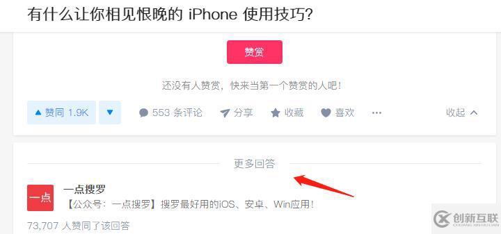
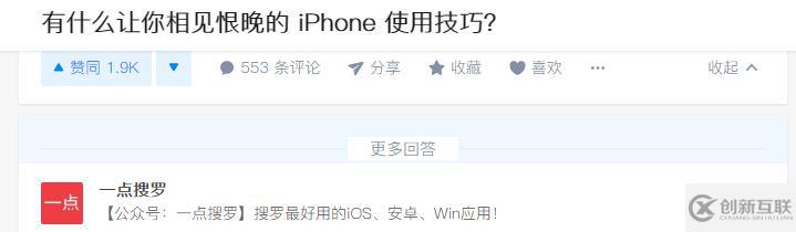
分割線(xiàn)是網(wǎng)頁(yè)中比較常見(jiàn)的一類(lèi)設(shè)計(jì)了,比如說(shuō)知乎的更多回答
這里的自適應(yīng)是指兩邊的橫線(xiàn)會(huì)隨著文字的個(gè)數(shù)和父級(jí)的寬度自適應(yīng)
偷偷的看了一下知乎的實(shí)現(xiàn),很顯然是用一塊白色背景覆蓋的,加一點(diǎn)背景就露餡了
心想:知乎的前端也不怎么樣?可能別人的重點(diǎn)不在這些上面吧
下面列舉幾種更好的實(shí)現(xiàn)方式,不會(huì)露餡的那種
1.偽元素+transform:translateX(-100%);
主要原理是設(shè)置文本居中text-align: center;,然后給定兩個(gè)偽元素,分別絕對(duì)定位,那么此時(shí)偽元素也是跟隨著水平居中的,設(shè)置足夠的寬度,然后把左邊的往左位移100%就可以了,父級(jí)記得超出隱藏。
具體實(shí)現(xiàn)如下
html結(jié)構(gòu)為
<div class="title">我是分割線(xiàn)</div>
css樣式為
.title{
    position: relative;
    text-align: center;
    overflow: hidden;
    font-size: 14px;
    color: #999;
}
.title::before,.title::after{
    content: '';
    display: inline-block;
    width: 100%;
    height: 1px;
    position: absolute;
    background: #ccc;
    top: 50%;
}
.title::before{
    margin-left: -10px;
    transform: translateX(-100%);
}
.title::after{
    margin-left: 10px;
}
CSS分隔線(xiàn) (偽元素+transform)
2.偽元素+flex
這個(gè)比較好理解了,設(shè)置display:flex,然后兩個(gè)偽元素分別鋪滿(mǎn)剩余空間。
具體實(shí)現(xiàn)如下
html結(jié)構(gòu)為
<div class="title">我是分割線(xiàn)</div>
css樣式為
.title{
    display: flex;
    align-items: center;
    font-size: 14px;
    color: #999;
}
.title::before,.title::after{
    content: '';
    flex: 1;
    height: 1px;
    background: #ccc;
}
.title::before{
    margin-right: 10px;
}
.title::after{
    margin-left: 10px;
}
CSS分隔線(xiàn) (偽元素+flex)
3.偽元素+box-shadow/outline+clip-path
同樣利用text-align: center使文本和偽元素居中,然后生成足夠大的box-shadow或者outline,由于不支持單個(gè)方向,所以用clip-path或者clip裁剪掉
具體實(shí)現(xiàn)如下
html結(jié)構(gòu)為
<div class="title">我是分割線(xiàn)</div>
css樣式為
.title{
    text-align: center;
    font-size: 14px;
    color: #999;
    overflow: hidden;
}
.title::before,.title::after{
    content: '';
    display: inline-block;
    width: 0;
    height: 1px;
    box-shadow: 0 0 0 9999px #ccc;
    vertical-align: middle;
}
.title::before{
    margin-right: 10px;
    clip-path: polygon(0 0, -9999px 0, -9999px 100%, 0 100%);
}
.title::after{
    margin-left: 10px;
    clip-path: polygon(0 0, 9999px 0, 9999px 100%, 0 100%);
}
CSS分隔線(xiàn) (偽元素+box-shadow/outline+clip-path)
4.偽元素+right:100%
這個(gè)實(shí)現(xiàn)需要多一層標(biāo)簽,外部仍然是text-align: center,內(nèi)部文本里添加兩個(gè)偽元素絕對(duì)定位,其中左邊的設(shè)置距離右邊100%(相對(duì)于文本標(biāo)簽)即可
具體實(shí)現(xiàn)如下
html結(jié)構(gòu)為
<div class="title">
   <span class="inner">我是分割線(xiàn)</span>
</div>
css樣式為
.title{
    text-align: center;
    font-size: 14px;
    color: #999;
    overflow: hidden;
}
.inner{
    position: relative;
}
.inner::before,.inner::after{
    position: absolute;
    content: '';
    width: 9999px;
    height: 1px;
    background: #ccc;
    top: 50%;
}
.inner::before{
    right: 100%;
    margin-right: 10px;
}
.inner::after{
    margin-left: 10px;
}
CSS分隔線(xiàn) (偽元素+right:100%)
5. border+transform
這個(gè)思路可以不用到偽元素,不過(guò)需要額外的標(biāo)簽,給內(nèi)部文本左右足夠大的1px邊框,此時(shí)需要設(shè)置line-height:1px,由于內(nèi)部整體以及足夠大了(超過(guò)父級(jí)),可以使用絕對(duì)定位和transform: translateX(-50%)居中
具體實(shí)現(xiàn)如下
html結(jié)構(gòu)為
<div class="title">
    <span class="inner">我是分割線(xiàn)</span>
</div>css樣式為
.title{
    position: relative;
    text-align: center;
    font-size: 14px;
    color: #999;
    overflow: hidden;
    padding: .6em 0;/**把高度撐起來(lái)**/
}
.inner{
    position: absolute;
    left: 50%;
    transform: translateX(-50%);
    white-space: nowrap;
    line-height: 1px;
    border-left: 9999px solid #ccc;
    border-right: 9999px solid #ccc;
    padding: 0 10px;
}
CSS分隔線(xiàn) (border+transform)
6.偽元素+border+left/right
這個(gè)思路只需要一個(gè)偽元素,在文本內(nèi)部生成一個(gè)偽元素,利用足夠大的border和相同的負(fù)值(絕對(duì)定位+left/right)還原位置
具體實(shí)現(xiàn)如下
html結(jié)構(gòu)為
<div class="title">
    <span class="inner">我是分割線(xiàn)</span>
</div>css樣式為
.title{
    text-align: center;
    font-size: 14px;
    color: #999;
    overflow: hidden;
}
.inner{
    position: relative;
    padding: 0 10px;
}
.inner::before{
    content: '';
    position: absolute;
    height: 1px;
    top: 50%;
    border-left: 9999px solid #ccc;
    border-right: 9999px solid #ccc;
    right: -9999px;
    left: -9999px;
}
CSS分隔線(xiàn) (偽元素+border+left/right)
7.偽元素+table-cell
主要思路為父級(jí)設(shè)置display:table,偽元素設(shè)置display:table-cell,并設(shè)置足夠大的寬度即可
具體實(shí)現(xiàn)如下
html結(jié)構(gòu)為
<div class="title">
    <span class="inner">我是分割線(xiàn)</span>
</div>css樣式為
.title{
    display: table;
    font-size: 14px;
    color: #999;
}
.inner{
    display: table-cell;
    white-space: nowrap;
    padding: 0 10px;
}
.title::before,.title::after{
    content: '';
    display: table-cell;
    width: 9999px;
    overflow: hidden;
    background: linear-gradient(#ccc 0,#ccc) center no-repeat;/**這里用線(xiàn)性漸變生成的,也可以用其他方式**/
    background-size: 100% 1px;
}
CSS分隔線(xiàn) (偽元素+table-cell)
8.fieldset+legend
利用fieldset和legend標(biāo)簽組合,可以天然實(shí)現(xiàn)分隔線(xiàn)效果,參考至張?chǎng)涡竦倪@篇文章
具體實(shí)現(xiàn)如下
html結(jié)構(gòu)為
<fieldset class="title">
    <legend class="inner">我是分割線(xiàn)</legend>
</fieldset>css樣式為
.title{
    font-size: 14px;
    color: #999;
    border: 0;
    border-top: 1px solid #ccc;
    padding: 0;
}
.inner{
    margin: 0 auto;;
    padding: 0 10px;
}
CSS分隔線(xiàn) (fieldset+legend)
小結(jié)
上面一共列舉了8中方式來(lái)實(shí)現(xiàn)分隔線(xiàn)的效果,每種方法思路各不相同,重要的是可以發(fā)散自己的想象力,可能這才是CSS與其他語(yǔ)言所不同的吧~
這里整理了一下,整體效果如下,可訪問(wèn)這里查看,大家在實(shí)際項(xiàng)目中可自行選取所需要的方式
.jpg)
感謝各位的閱讀!關(guān)于CSS實(shí)現(xiàn)自適應(yīng)分隔線(xiàn)的方法就分享到這里了,希望以上內(nèi)容可以對(duì)大家有一定的幫助,讓大家可以學(xué)到更多知識(shí)。如果覺(jué)得文章不錯(cuò),可以把它分享出去讓更多的人看到吧!
網(wǎng)站題目:CSS實(shí)現(xiàn)自適應(yīng)分隔線(xiàn)的方法
本文網(wǎng)址:http://chinadenli.net/article26/gphjjg.html
成都網(wǎng)站建設(shè)公司_創(chuàng)新互聯(lián),為您提供微信公眾號(hào)、網(wǎng)站營(yíng)銷(xiāo)、企業(yè)建站、網(wǎng)站排名、做網(wǎng)站、標(biāo)簽優(yōu)化
聲明:本網(wǎng)站發(fā)布的內(nèi)容(圖片、視頻和文字)以用戶(hù)投稿、用戶(hù)轉(zhuǎn)載內(nèi)容為主,如果涉及侵權(quán)請(qǐng)盡快告知,我們將會(huì)在第一時(shí)間刪除。文章觀點(diǎn)不代表本網(wǎng)站立場(chǎng),如需處理請(qǐng)聯(lián)系客服。電話(huà):028-86922220;郵箱:631063699@qq.com。內(nèi)容未經(jīng)允許不得轉(zhuǎn)載,或轉(zhuǎn)載時(shí)需注明來(lái)源: 創(chuàng)新互聯(lián)

- 品牌網(wǎng)站制作想要滿(mǎn)意 必須要懂得的三點(diǎn)溝通技巧 2015-08-24
- 品牌網(wǎng)站制作常見(jiàn)的布局方式 2022-03-22
- 湛江品牌網(wǎng)站制作:做好品牌網(wǎng)站制作方案有哪些要點(diǎn)? 2021-12-23
- 高端品牌網(wǎng)站制作離不開(kāi)獨(dú)特新穎的設(shè)計(jì) 2016-10-30
- 什么是品牌網(wǎng)站,品牌網(wǎng)站制作需要注意哪些內(nèi)容? 2016-10-15
- 品牌網(wǎng)站制作解決方案七步走 2021-12-19
- 品牌網(wǎng)站制作應(yīng)該體現(xiàn)企業(yè)文化和個(gè)性 2021-08-12
- 品牌網(wǎng)站制作方案要怎么做 2021-08-28
- 品牌網(wǎng)站制作的價(jià)格為什么那么高呢? 2016-10-28
- 品牌網(wǎng)站制作好后網(wǎng)站URL優(yōu)化有技巧 2022-08-12
- 品牌網(wǎng)站制作解決方案 2016-09-12
- SEO優(yōu)化如何才能戰(zhàn)勝競(jìng)爭(zhēng)對(duì)手 2022-06-04