html中移動端1px的示例分析-創(chuàng)新互聯(lián)
這篇文章主要為大家展示了“html中移動端1px的示例分析”,內(nèi)容簡而易懂,條理清晰,希望能夠幫助大家解決疑惑,下面讓小編帶領(lǐng)大家一起研究并學(xué)習(xí)一下“html中移動端1px的示例分析”這篇文章吧。

問題
為什么有 1px 這個問題?
實現(xiàn) 1px 有哪些方法?這些方法分別有哪些優(yōu)缺點(diǎn)?
開源項目中使用的哪些解決方案?
如何在項目中處理 1px 的相關(guān)問題?
由來
基本概念
首先,我們要了解兩個概念,一個是像素(pixel)可以簡寫為 px,另外一個是設(shè)備像素比(DPR)
像素 :指在由一個數(shù)字序列表示的圖像中的一個最小單元,單位是 px,不可再次分割了。
設(shè)備像素比(DPR): 設(shè)備像素比 = 設(shè)備像素 / 設(shè)備獨(dú)立像素。
下面我來簡單解釋下幾個概念
CSS 像素 (虛擬像素):指的是 CSS 樣式代碼中使用的邏輯像素,在 CSS 規(guī)范中,長度單位可以分為兩類,絕對單位以及相對單位。px 是一個相對單位,相對的是設(shè)備像素。
設(shè)備像素 (物理像素):指設(shè)備能控制顯示的最小物理單位,意指顯示器上一個個的點(diǎn)。從屏幕在工廠生產(chǎn)出的那天起,它上面設(shè)備像素點(diǎn)就固定不變了,和屏幕尺寸大小有關(guān)。
設(shè)備獨(dú)立像素 (邏輯像素):可以認(rèn)為是計算機(jī)坐標(biāo)系統(tǒng)中得一個點(diǎn),這個點(diǎn)代表一個可以由程序使用的虛擬像素(比如: CSS 像素),這個點(diǎn)是沒有固定大小的,越小越清晰,然后由相關(guān)系統(tǒng)轉(zhuǎn)換為物理像素。 也就是說,當(dāng)邏輯像素是 1pt 時,在 DPR 為 2 的 設(shè)備上顯示為 2px 的物理像素
參考數(shù)據(jù)
各種類型的 iphone 手機(jī)屏幕設(shè)備的參數(shù)
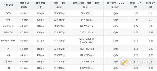
注:這里的縮放因子呢,就是 DRP 的值
設(shè)計稿對比數(shù)據(jù)
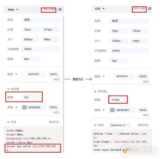
會有人好奇,為什么設(shè)計稿上顯示是 750x1334 呢,這是因為設(shè)計稿是顯示的物理像素
而我們 css 中的像素是邏輯像素 應(yīng)該為 375x 667,在編寫代碼時要將自定義寬度設(shè)置成 375px
那么此時設(shè)計稿上的 1px 寬度實際代表的 css 參數(shù)應(yīng)該是 0.5px 對應(yīng)物理像素 1px,那么怎么實現(xiàn)這個物理像素為 1px 呢
實踐
歸根結(jié)底有兩種方案,一種是利用 css 中的transfrom:scaleY(0.5) ,另一種是設(shè)置 媒體查詢根據(jù)不同 DPR 縮放
解決方案一
原理
利用 css 的 偽元素::after +transfrom 進(jìn)行縮放
為什么用偽元素?因為偽元素::after 或::before 是獨(dú)立于當(dāng)前元素,可以單獨(dú)對其縮放而不影響元素本身的縮放
偽元素大多數(shù)瀏覽器默認(rèn)單引號也可以使用,和偽類一樣形式,而且單引號兼容性(ie)更好些
實現(xiàn)
<div class="cell border-1px"> cell <div>

<style>
.cell {
    width: 100px;
    height: 100px;
}
<!--全部邊框-->
.border-1px:after {
    content: '';
    position: absolute;
    box-sizing: border-box;
    top: 0;
    left: 0;
    width: 200%;
    height: 200%;
    border: 1px solid #000;
    border-radius: 4px;
    -webkit-transform: scale(0.5);
    transform: scale(0.5);
    -webkit-transform-origin: top left;
}

<!--單邊框,以上邊框為例-->
.border-1px-top:before {
    content: "";
    position: absolute;
    top: 0;
    left: 0;
    right: 0;
    border-top: 1px solid red;
    transform: scaleY(.5);
    transform-origin: left top;
}
</style>
解決方案二(升級方案一)
原理
使用 less 對公共代碼(方案一)封裝,同時增加媒體查詢分別對不同 DPR 的設(shè)備,進(jìn)行不同的縮放
.border(
    @borderWidth: 1px;
    @borderStyle: solid;
    @borderColor: @lignt-gray-color;
    @borderRadius: 0) {
    position: relative;
    &:before {
        content: '';
        position: absolute;
        width: 98%;
        height: 98%;
        top: 0;
        left: 0;
        transform-origin: left top;
        -webkit-transform-origin: left top;
        box-sizing: border-box;
        pointer-events: none;
    }
    @media (-webkit-min-device-pixel-ratio: 2) {
        &:before {
            width: 200%;
            height: 200%;
            -webkit-transform: scale(.5);
        }
    }
    @media (-webkit-min-device-pixel-ratio: 2.5) {
        &:before {
            width: 250%;
            height: 250%;
            -webkit-transform: scale(.4);
        }
    }
    @media (-webkit-min-device-pixel-ratio: 2.75) {
        &:before {
            width: 275%;
            height: 275%;
            -webkit-transform: scale(1 / 2.75);
        }
    }
    @media (-webkit-min-device-pixel-ratio: 3) {
        &:before {
            width: 300%;
            height: 300%;
            transform: scale(1 / 3);
            -webkit-transform: scale(1 / 3);
        }
    }
    .border-radius(@borderRadius);
    &:before {
        border-width: @borderWidth;
        border-style: @borderStyle;
        border-color: @borderColor;
    }
}

.border-all(
	@borderWidth: 1px;
	@borderStyle: solid;
	@borderColor: @lignt-gray-color;
	@borderRadius: 0) {
    .border(@borderWidth; @borderStyle; @borderColor; @borderRadius);
}
其他方案:
使用圖片:兼容性好,靈活行最差,不能改變顏色、長度
使用viewport 和rem ,js 動態(tài)改變viewport 中scale 縮放,缺點(diǎn)在于不適用于已有的項目,例如:使用vh 和vw 布局的
<meta name="viewport" id="WebViewport" content="initial-scale=1, maximum-scale=1, minimum-scale=1, user-scalable=no">
使用 css 漸變linear-gradient 或者box-shadow
上述 3 種方案均有致命缺陷暫不推薦使用
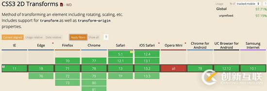
兼容性
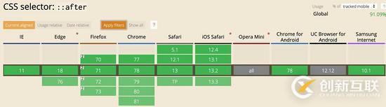
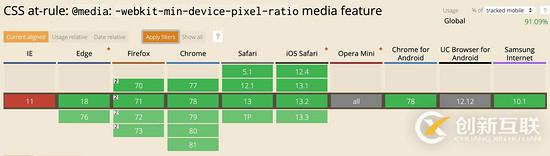
最后看一下兼容性如何,主要是偽元素、transform:scale 和min-device-pixel-ratio 這幾個關(guān)鍵詞的兼容性
開源庫的解決方案
vant 組件庫
跳去 github 查看相關(guān)代碼
使用less 寫的
.hairline-common() {
  position: absolute;
  box-sizing: border-box;
  content: ' ';
  pointer-events: none;
}

.hairline(@color: @border-color) {
  .hairline-common();

  top: -50%;
  right: -50%;
  bottom: -50%;
  left: -50%;
  border: 0 solid @color;
  transform: scale(0.5);
}
也是采用第一種解決方案
ant-design-mobile 組件庫
跳去 github 查看相關(guān)代碼
.scale-hairline-common(@color, @top, @right, @bottom, @left) {
  content: '';
  position: absolute;
  background-color: @color;
  display: block;
  z-index: 1;
  top: @top;
  right: @right;
  bottom: @bottom;
  left: @left;
}

.hairline(@direction, @color: @border-color-base) when (@direction = 'top') {
  border-top: 1PX solid @color;

  html:not([data-scale]) & {
    @media (min-resolution: 2dppx) {
      border-top: none;

      &::before {
        .scale-hairline-common(@color, 0, auto, auto, 0);
        width: 100%;
        height: 1PX;
        transform-origin: 50% 50%;
        transform: scaleY(0.5);

        @media (min-resolution: 3dppx) {
          transform: scaleY(0.33);
        }
      }
    }
  }
}

.hairline(@direction, @color: @border-color-base) when (@direction = 'right') {
  border-right: 1PX solid @color;

  html:not([data-scale]) & {
    @media (min-resolution: 2dppx) {
      border-right: none;

      &::after {
        .scale-hairline-common(@color, 0, 0, auto, auto);
        width: 1PX;
        height: 100%;
        background: @color;
        transform-origin: 100% 50%;
        transform: scaleX(0.5);

        @media (min-resolution: 3dppx) {
          transform: scaleX(0.33);
        }
      }
    }
  }
}
.hairline(@direction, @color: @border-color-base) when (@direction = 'bottom') {
  border-bottom: 1PX solid @color;
  html:not([data-scale]) & {
    @media (min-resolution: 2dppx) {
      border-bottom: none;
      &::after {
        .scale-hairline-common(@color, auto, auto, 0, 0);
        width: 100%;
        height: 1PX;
        transform-origin: 50% 100%;
        transform: scaleY(0.5);
        @media (min-resolution: 3dppx) {
          transform: scaleY(0.33);
        }
      }
    }
  }
}

.hairline(@direction, @color: @border-color-base) when (@direction = 'left') {
  border-left: 1PX solid @color;

  html:not([data-scale]) & {
    @media (min-resolution: 2dppx) {
      border-left: none;

      &::before {
        .scale-hairline-common(@color, 0, auto, auto, 0);
        width: 1PX;
        height: 100%;
        transform-origin: 100% 50%;
        transform: scaleX(0.5);

        @media (min-resolution: 3dppx) {
          transform: scaleX(0.33);
        }
      }
    }
  }
}

.hairline(@direction, @color: @border-color-base, @radius: 0) when (@direction = 'all') {
  border: 1PX solid @color;
  border-radius: @radius;

  html:not([data-scale]) & {
    @media (min-resolution: 2dppx) {
      position: relative;
      border: none;

      &::before {
        content: '';
        position: absolute;
        left: 0;
        top: 0;
        width: 200%;
        height: 200%;
        border: 1PX solid @color;
        border-radius: @radius * 2;
        transform-origin: 0 0;
        transform: scale(0.5);
        box-sizing: border-box;
        pointer-events: none;

        // @media (min-resolution: 3dppx) {
        //   width: 300%;
        //   height: 300%;
        //   border-radius: @radius * 3;
        //   transform: scale(0.33);
        // }
      }
    }
  }
}
這個值得研究下,比 vant 和 第一種解決方案有點(diǎn)不同,主要在于處理了 DPR 為 2 和為 3 的兩種情況,相比來說更加完善。
這里 PX 大寫,為了防止插件將 px 轉(zhuǎn)成 rem 等單位。
以上是“html中移動端1px的示例分析”這篇文章的所有內(nèi)容,感謝各位的閱讀!相信大家都有了一定的了解,希望分享的內(nèi)容對大家有所幫助,如果還想學(xué)習(xí)更多知識,歡迎關(guān)注創(chuàng)新互聯(lián)行業(yè)資訊頻道!
網(wǎng)站題目:html中移動端1px的示例分析-創(chuàng)新互聯(lián)
分享網(wǎng)址:http://chinadenli.net/article26/gohjg.html
成都網(wǎng)站建設(shè)公司_創(chuàng)新互聯(lián),為您提供App設(shè)計、微信小程序、移動網(wǎng)站建設(shè)、企業(yè)建站、自適應(yīng)網(wǎng)站、商城網(wǎng)站
聲明:本網(wǎng)站發(fā)布的內(nèi)容(圖片、視頻和文字)以用戶投稿、用戶轉(zhuǎn)載內(nèi)容為主,如果涉及侵權(quán)請盡快告知,我們將會在第一時間刪除。文章觀點(diǎn)不代表本網(wǎng)站立場,如需處理請聯(lián)系客服。電話:028-86922220;郵箱:631063699@qq.com。內(nèi)容未經(jīng)允許不得轉(zhuǎn)載,或轉(zhuǎn)載時需注明來源: 創(chuàng)新互聯(lián)
猜你還喜歡下面的內(nèi)容

- 雄安新區(qū)網(wǎng)頁設(shè)計公司定制網(wǎng)站有什么好處? 2020-11-22
- 網(wǎng)頁設(shè)計公司對于頁面配色的選擇會著重考慮哪些要點(diǎn)? 2016-10-15
- 北京網(wǎng)頁設(shè)計公司 2021-05-19
- 佛山順德網(wǎng)頁設(shè)計公司容易被忽視的三大問題 2022-11-13
- 網(wǎng)頁設(shè)計公司如何創(chuàng)建配色方案 2021-05-10
- 企業(yè)網(wǎng)頁設(shè)計價格方案,不同網(wǎng)頁設(shè)計公司的價格時間工期 2021-05-25
- 如何維護(hù)成都網(wǎng)頁設(shè)計公司的服務(wù)器? 2016-10-27
- 成都網(wǎng)頁設(shè)計公司:滾動型長頁面怎么設(shè)計? 2016-11-02
- 如何讓你的網(wǎng)站更添色彩,成都網(wǎng)頁設(shè)計公司告訴你 2022-07-28
- 深圳網(wǎng)頁設(shè)計公司哪家好? 2022-06-11
- 成都網(wǎng)頁設(shè)計公司怎么去打造響應(yīng)型網(wǎng)站? 2016-10-21
- 3個不可靠的網(wǎng)頁設(shè)計公司的跡象 2022-08-28