css3實(shí)現(xiàn)文字漸變的方法-創(chuàng)新互聯(lián)
這篇文章主要介紹了css3實(shí)現(xiàn)文字漸變的方法,具有一定借鑒價(jià)值,需要的朋友可以參考下。希望大家閱讀完這篇文章后大有收獲。下面讓小編帶著大家一起了解一下。

在開(kāi)發(fā)過(guò)程中,UI設(shè)計(jì)師經(jīng)常會(huì)設(shè)計(jì)一些帶漸變文字的設(shè)計(jì)圖,給到我們程序員,而我們程序員們呢,大多都是默默地嘆息傳來(lái),不過(guò)CSS3的誕生,解決了前端開(kāi)發(fā)過(guò)程中的好多個(gè)難題,比如動(dòng)畫(huà),遮罩等等
1. 我們今天要實(shí)現(xiàn)的就是使用純CSS實(shí)現(xiàn)漸變文字,下面是預(yù)覽圖片:
2. 基礎(chǔ)樣式:
.gradient-text{
text-align: left;
text-indent:30px;
line-height: 50px;
font-size:40px;
font-weight:bolder;
position: relative;
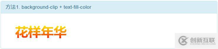
}3. 第一種方法,使用 background-cli、 text-fill-color:
.gradient-text-one{
background-image:-webkit-linear-gradient(bottom,red,#fd8403,yellow);
-webkit-background-clip:text;
-webkit-text-fill-color:transparent;
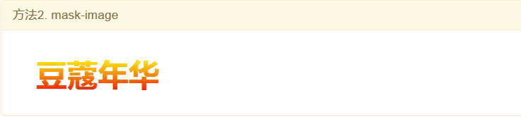
}4. 第二種方法,使用 mask-image:
.gradient-text-two{
color:red;
}
.gradient-text-two[data-content]::after{
content:attr(data-content);
display: block;
position:absolute;
color:yellow;
left:0;
top:0;
z-index:2;
-webkit-mask-image:-webkit-gradient(linear, 0 0, 0 bottom, from(yellow), to(rgba(0, 0, 255, 0)));
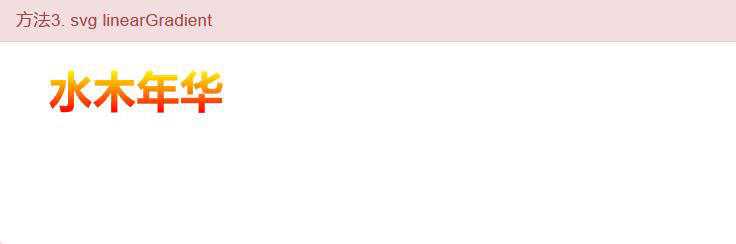
}5.第三種方法,使用 linearGradient、fill:
.gradient-text-three{
    fill:url(#SVGID_1_);
    font-size:40px;
    font-weight:bolder;
}
<svg viewBoxs="0 0 500 300" class="svgBox">
<defs>
<linearGradient id="SVGID_1_" gradientUnits="userSpaceOnUse" x1="0" y1="10" x2="0" y2="50">
<stop offset="0" style="stop-color:yellow"/>
<stop offset="0.5" style="stop-color:#fd8403"/>
<stop offset="1" style="stop-color:red"/>
</linearGradient>
</defs>
<text text-anchor="middle" class="gradient-text-three" x="110px" y="30%">花信年華</text>
</svg>6. 該DEMO全部代碼:
<!DOCTYPE html>
<html>
<head>
<meta charset="utf-8">
<meta name="viewport" content="width=device-width, user-scalable=no, initial-scale=1.0, maximum-scale=1.0, minimum-scale=1.0">
<title>CSS3漸變字體</title>
<link rel="stylesheet" href="https://cdn.bootcss.com/bootstrap/3.3.7/css/bootstrap.min.css">
<script src="https://cdn.bootcss.com/jquery/2.1.1/jquery.min.js"></script>
<script src="https://cdn.bootcss.com/bootstrap/3.3.7/js/bootstrap.min.js"></script>
<style type="text/css">
*{margin:0;padding:0;}
body,html{width:100%;height:100%;}
.wrapper{width:80%;margin:0 auto;margin-top:30px;}
.gradient-text{
text-align: left;
text-indent:30px;
line-height: 50px;
font-size:40px;
font-weight:bolder;
position: relative;
}
.gradient-text-one{
background-image:-webkit-linear-gradient(bottom,red,#fd8403,yellow);
-webkit-background-clip:text;
-webkit-text-fill-color:transparent;
}
.gradient-text-two{
color:red;
}
.gradient-text-two[data-content]::after{
content:attr(data-content);
display: block;
position:absolute;
color:yellow;
left:0;
top:0;
z-index:2;
-webkit-mask-image:-webkit-gradient(linear, 0 0, 0 bottom, from(yellow), to(rgba(0, 0, 255, 0)));
}
.gradient-text-three{
fill:url(#SVGID_1_);
font-size:40px;
font-weight:bolder;
}
</style>
</head>
<body>
<section class="wrapper">
<div class="panel panel-info">
<div class="panel-heading">
<h4 class="panel-title">方法1. background-clip + text-fill-color</h4>
</div>
<div class="panel-body">
<h4 class="gradient-text gradient-text-one">花樣年華</h4>
</div>
</div>
<div class="panel panel-warning">
<div class="panel-heading">
<h4 class="panel-title">方法2. mask-image</h4>
</div>
<div class="panel-body">
<h4 class="gradient-text gradient-text-two" data-content="豆蔻年華">豆蔻年華</h4>
</div>
</div>
<div class="panel panel-danger">
<div class="panel-heading">
<h4 class="panel-title">方法3. svg linearGradient</h4>
</div>
<div class="panel-body">
<svg viewBoxs="0 0 500 300" class="svgBox">
    <defs>
        <linearGradient id="SVGID_1_" gradientUnits="userSpaceOnUse" x1="0" y1="10" x2="0" y2="50">
            <stop  offset="0" style="stop-color:yellow"/>
            <stop  offset="0.5" style="stop-color:#fd8403"/>
            <stop  offset="1" style="stop-color:red"/>
        </linearGradient>
    </defs>
    <text text-anchor="middle" class="gradient-text-three" x="110px" y="30%">花信年華</text>
</svg>
</div>
</div>
</section>
</body>
</html>感謝你能夠認(rèn)真閱讀完這篇文章,希望小編分享css3實(shí)現(xiàn)文字漸變的方法內(nèi)容對(duì)大家有幫助,同時(shí)也希望大家多多支持創(chuàng)新互聯(lián)成都網(wǎng)站設(shè)計(jì)公司,關(guān)注創(chuàng)新互聯(lián)成都網(wǎng)站設(shè)計(jì)公司行業(yè)資訊頻道,遇到問(wèn)題就找創(chuàng)新互聯(lián)成都網(wǎng)站設(shè)計(jì)公司,詳細(xì)的解決方法等著你來(lái)學(xué)習(xí)!
另外有需要云服務(wù)器可以了解下創(chuàng)新互聯(lián)scvps.cn,海內(nèi)外云服務(wù)器15元起步,三天無(wú)理由+7*72小時(shí)售后在線,公司持有idc許可證,提供“云服務(wù)器、裸金屬服務(wù)器、網(wǎng)站設(shè)計(jì)器、香港服務(wù)器、美國(guó)服務(wù)器、虛擬主機(jī)、免備案服務(wù)器”等云主機(jī)租用服務(wù)以及企業(yè)上云的綜合解決方案,具有“安全穩(wěn)定、簡(jiǎn)單易用、服務(wù)可用性高、性價(jià)比高”等特點(diǎn)與優(yōu)勢(shì),專為企業(yè)上云打造定制,能夠滿足用戶豐富、多元化的應(yīng)用場(chǎng)景需求。
分享標(biāo)題:css3實(shí)現(xiàn)文字漸變的方法-創(chuàng)新互聯(lián)
當(dāng)前路徑:http://chinadenli.net/article18/dspidp.html
成都網(wǎng)站建設(shè)公司_創(chuàng)新互聯(lián),為您提供網(wǎng)站設(shè)計(jì)公司、手機(jī)網(wǎng)站建設(shè)、網(wǎng)頁(yè)設(shè)計(jì)公司、動(dòng)態(tài)網(wǎng)站、搜索引擎優(yōu)化、面包屑導(dǎo)航
聲明:本網(wǎng)站發(fā)布的內(nèi)容(圖片、視頻和文字)以用戶投稿、用戶轉(zhuǎn)載內(nèi)容為主,如果涉及侵權(quán)請(qǐng)盡快告知,我們將會(huì)在第一時(shí)間刪除。文章觀點(diǎn)不代表本網(wǎng)站立場(chǎng),如需處理請(qǐng)聯(lián)系客服。電話:028-86922220;郵箱:631063699@qq.com。內(nèi)容未經(jīng)允許不得轉(zhuǎn)載,或轉(zhuǎn)載時(shí)需注明來(lái)源: 創(chuàng)新互聯(lián)
猜你還喜歡下面的內(nèi)容
- 基于JS實(shí)現(xiàn)9種不同的面包屑和分布式多步驟導(dǎo)航效果-創(chuàng)新互聯(lián)
- ThinkPHP容器中綁定參數(shù)的示例分析-創(chuàng)新互聯(lián)
- 基于數(shù)采儀下自然災(zāi)害監(jiān)測(cè)系統(tǒng)解決方案-創(chuàng)新互聯(lián)
- vue3默認(rèn)把所有onSomething當(dāng)作v-on事件綁定的原因-創(chuàng)新互聯(lián)
- springboot使用lua腳本解決分布式鎖釋放的問(wèn)題-創(chuàng)新互聯(lián)
- c++如何防止頭文件重復(fù)引入-創(chuàng)新互聯(lián)
- Bootstrap屬于前端框架嗎-創(chuàng)新互聯(lián)

- 怎么判斷建站公司是否靠譜? 2021-06-23
- 成都建站公司:做定制化網(wǎng)站有什么好? 2022-08-21
- 徐州網(wǎng)絡(luò)公司:選擇正規(guī)的建站公司看這幾招! 2021-12-16
- 成都建站公司:國(guó)內(nèi)互聯(lián)網(wǎng)產(chǎn)品監(jiān)管體系猜測(cè) 2023-03-03
- 深圳建站公司創(chuàng)新互聯(lián)對(duì)手機(jī)網(wǎng)站建設(shè)的收費(fèi)是怎么算的? 2015-10-24
- 上海建站公司是最方便快捷制作 2020-05-25
- 建站公司主要競(jìng)爭(zhēng)對(duì)手分析策略 2021-10-29
- 在選擇建站公司做網(wǎng)站如何選擇模板還是定制開(kāi) 2021-08-15
- 哪家建站公司做企業(yè)網(wǎng)站比較好 2022-08-10
- 選擇建站公司要考察的關(guān)鍵能力 2017-08-08
- 怎樣挑選建站公司 2021-10-30
- 貴陽(yáng)建站公司:做網(wǎng)站的時(shí)候如何才能確定網(wǎng)站的主題? 2021-10-25