純CSS3如何繪制打火機(jī)動畫火焰效果
小編給大家分享一下純CSS3如何繪制打火機(jī)動畫火焰效果,相信大部分人都還不怎么了解,因此分享這篇文章給大家參考一下,希望大家閱讀完這篇文章后大有收獲,下面讓我們一起去了解一下吧!
目前成都創(chuàng)新互聯(lián)已為上1000+的企業(yè)提供了網(wǎng)站建設(shè)、域名、雅安服務(wù)器托管、網(wǎng)站改版維護(hù)、企業(yè)網(wǎng)站設(shè)計(jì)、馬關(guān)網(wǎng)站維護(hù)等服務(wù),公司將堅(jiān)持客戶導(dǎo)向、應(yīng)用為本的策略,正道將秉承"和諧、參與、激情"的文化,與客戶和合作伙伴齊心協(xié)力一起成長,共同發(fā)展。
本文實(shí)例為大家分享了純CSS3繪制打火機(jī)動畫火焰效果的具體代碼,供大家參考,具體內(nèi)容如下
主要涉及到了以下屬性:
XML/HTML Code復(fù)制內(nèi)容到剪貼板
<span style="font-family:Comic Sans MS;">animation(webkit-animation),
@keyframes name (@-webkit-keyframes name),
transform,
transform-origin,
transition,
box-shadow(spread屬性),
text-shadow
z-index
linear-gradient。
radial-gradient
background-image
</span>
首先html代碼如下:
XML/HTML Code復(fù)制內(nèi)容到剪貼板
 <span style="font-family:Comic Sans MS;"><!DOCTYPE html>
<html>
 <head>
  <meta charset="UTF-8">
  <title>純CSS繪制打火機(jī)動畫火焰特效</title>
  <link rel="stylesheet" href="css/style.css">
 </head>
 <body class="keBody">
  <h2 class="keTitle">純CSS3繪制打火機(jī)動畫火焰特效</h2>
  <div class="kePublic">
   <div class="playground">
    <div class="flame"></div>
    <div class="lighterBody">
     <div class="hover">hover me</div>
    </div>
    <div class="lid"></div>
   </div>
   <div class="clear"></div>
  </div>
 </body>
</html></span>
style.css文件如下:
CSS Code復(fù)制內(nèi)容到剪貼板
<span style="font-family:Comic Sans MS;">@charset "utf-8";
body{
margin:0;
padding:0;
color:#333;
text-align:center;
font:12px "微軟雅黑";
}
:before,:after{
position:absolute;
content:"";
}
.keBody{
background:url(../images/bodyBg.jpg) repeat #333;
}
.keTitle{
height:100px;
line-height:100px;
font-size:30px;
font-family:'微軟雅黑';
color:#fff;
text-align:center;
background:url(../images/bodyBg3.jpg) repeat-x bottombottom left;
font-weight:normal;
margin-bottom:0;
}
.kePublic{
background:#cccccc;
padding:50px;
}
.playground{
position:relative;
width:140px;
height:400px;
left:50%;
margin-left:-70px;
}
.flame{
opacity: 0;
position: absolute;
bottombottom: 60%;
left: 42%;
width: 14px;
height: 70px;
background-color: white;
border-radius: 100% 100% 0 0;
box-shadow: 0 0 20px #FFFEF0, 0 0 20px #FFFEE6, 0 0 20px #fefcc9, 10px -10px 30px #feec85, -20px -20px 40px #ffae34, 20px -40px 50px #ec760c, -20px -60px 60px #cd4606, 0 -80px 70px #973716, 10px -90px 80px #451b0e;
}
.playground:hover .flame {
opacity:1;
transition:opacity 3s linear;
-webkit-animation:flame 1s infinite linear;
}
.playground:hover .lid{
-webkit-animation:lidoff 1s linear;
/*把物體動畫地從一個(gè)地方移動到另一個(gè)地方,并讓它停留在那里:*/
-webkit-animation-fill-mode:forwards;
}
.lighterBody{
position:absolute;
width:140px;
height:130px;
top:200px;
left:0;
background-image:linear-gradient(to rightright,#959595 0%,#0d0d0d 46%,#010101 50%,#0a0a0a 53%,
#4e4e4e 76%,#383838 87%,#1b1b1b 100%);
border-radius:2% 2% 8% 8%;
box-shadow:inset 0 0 5px 5px #333;
}
.lighterBody:before{
width:47px;
height:47px;
top:-50px;
left: 42px;
content:"...";
color:#e6e6e6;
border-radius:6% 6% 0 0;
background-image:linear-gradient(to rightright,#f5f5f5 0%,#dbdce2 21%,#b8bac6 49%,#dddfe3 80%,#f5f6f6 100%);
font-size:30px;
font-weight:bold;
letter-spacing:7px;
line-height:16px;
text-shadow:0 0 5px black;
padding-top:3px;
padding-left:4px;
}
.lighterBody:after{
width:33px;
height:33px;
background-image:radial-gradient(ellipse at center,#7d737d 0%,#0e0e0e 100%);
border-radius:100%;
top:-33px;
left:10px;
box-shadow:inset 0 0 1px 2px gray;
}
.lid{
z-index:2;
position:absolute;
width:140px;
height:75px;
top:125px;
left:0;
background:linear-gradient(to rightright,#959595 0%,#0d0d0d 46%, #010101 50%, #0a0a0a 53%, #4e4e4e 76%, #383838 87%, #1b1b1b 100%);
border-radius:8% 8% 2% 2%;
box-shadow:inset 0 0 5px 5px #333;
/*border-bottom:3px solid #f2f2f2;*/
}
.lid:before{
width:10px;
height:10px;
top:70px;
left:133px;
background-image:radial-gradient(ellipse at center, #959595 0%, #0d0d0d 46%, #010101 50%, #0a0a0a 53%, #4e4e4e 76%, #383838 87%, #1b1b1b 100%);
border-radius:100%;
}
.hover{
z-index:1;
text-align:center;
margin-top:30%;
color:rgba(255,255,255,0.9);
text-shadow:0 1px 1px rgba(0,0,0,0.8);
font: 20px "微軟雅黑";
}
.hover:before{
content:"";
z-index:1;
width:0;
height:0;
top:-50px;
left:20px;
border-bottom:35px solid #f2f2f2;
/*border-left:10px solid transparent;*/
}
@-webkit-keyframes flame{
0%{
height:70px;
transform:skewY(0deg);
border-radius:100% 100% 0 0;
}
25%{
height:60px;
transform:skewY(40deg);
border-radius:10% 100% 0 0;
}
60%{
height:65px;
transform:skewY(-20deg);
border-radius:90% 10% 0 0;
}
70%{
height:50px;
transform:skewY(10deg);
border-radius:10% 100% 0 0;
}
100%{
height:70px;
tranform:skewY(0deg);
}
}
@-webkit-keyframes lidoff{
from{
transform:rotate(0deg);
transform-origin:100% 100%;
}
to{
transform:rotate(130deg);
transform-origin:100% 100%;
}
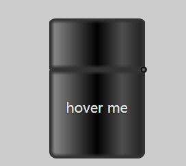
}</span>初始照片:
動態(tài)照片
.jpg)
動畫效果主要有兩個(gè),一是當(dāng)鼠標(biāo)懸停在“hover me”上面時(shí)打火機(jī)蓋子打開的情形,由下面的動畫代碼實(shí)現(xiàn):
XML/HTML Code復(fù)制內(nèi)容到剪貼板
 <span style="font-family:Comic Sans MS;font-size:12px;">@-webkit-keyframes lidoff{     注意這里要加上-webkit-
     from{
          transform:rotate(0deg);
          transform-origin:100% 100%;
     }
     to{
          transform:rotate(130deg);
          transform-origin:100% 100%;
     }
}
</span>
第二個(gè)動畫是蠟燭燈光效果的實(shí)現(xiàn):蠟燭由按變量是由transition:opacity 3s linear; 實(shí)現(xiàn)的,
蠟燭燈光的隨風(fēng)擺動效果是由下面的代碼實(shí)現(xiàn)的:
XML/HTML Code復(fù)制內(nèi)容到剪貼板
<span style="font-family:Comic Sans MS;font-size:12px;">@-webkit-keyframes lidoff{
    from{
         transform:rotate(0deg);
         transform-origin:100% 100%;
    }
    to{
         transform:rotate(130deg);
         transform-origin:100% 100%;
    }
</span>
將打火機(jī)蓋與軀干分離的效果是由:box-shadow:inset 0 0 5px 5px #333; 主要是這里的inset(注意不要寫成了insert)實(shí)現(xiàn)的。
當(dāng)打火機(jī)打開時(shí)出現(xiàn)的圓球和白色的小正方形,是由:after :before 配合z-index實(shí)現(xiàn)的效果。
下面來介紹通過這個(gè)例子我的學(xué)到的幾個(gè)屬性需要注意的地方。
transform-origin: 默認(rèn)的初始位置是圖像的中心,100% 100%相當(dāng)于 right bottom. 0% 0%相當(dāng)于 left top.
before 和:after :注入的內(nèi)容是有關(guān)聯(lián)的目標(biāo)元素的字子元素,但它會被置于這個(gè)元素任何內(nèi)容的“前” 或"后"。插入的內(nèi)容在頁面的源碼里是看不見的,只能在css里看見。同時(shí)插入的元素在默認(rèn)情況是內(nèi)聯(lián)元素。因此,為了給插入的元素賦予高度、填充、邊距等等,通常必須顯示的定義一個(gè)塊級元素(display:block)。
此外,雖然可能不會插入任何內(nèi)容,但是content必須寫上,如果不插入任何內(nèi)容,那么content寫成 content:"";
IE6和IE7不兼容這兩個(gè)為元素
偽元素(雙冒號),css3中的偽類是(單冒號)
animation-fill-mode: none|forwards|backwards|both|initial|inherit;
規(guī)定當(dāng)動畫不播放時(shí)(當(dāng)動畫完成時(shí),或當(dāng)動畫有一個(gè)延遲未開始播放時(shí)),要應(yīng)用到元素的樣式。
background-image:解決了div只能設(shè)置一個(gè)背景的問題,使一個(gè)div可以設(shè)置多個(gè)背景圖片。
box-shadow:一個(gè)經(jīng)常被遺忘的參數(shù)--spread(擴(kuò)展陰影半徑),這個(gè)曾經(jīng)被遺忘的spread改變陰影的大小---其值可以是正負(fù)值,如果值為正,則整個(gè)陰影都延展擴(kuò)大,反之是負(fù)值,則縮小。有了這個(gè)參數(shù)后可以使用box-shadow像photoshop中的陰影工作一樣,制作單邊陰影效果。這里注意一點(diǎn),這個(gè)擴(kuò)展陰影值需要和陰影模糊半徑配合使用,一般情況是“擴(kuò)展陰影半徑一般設(shè)置為和模糊半徑大小,并去其負(fù)值”
以上是“純CSS3如何繪制打火機(jī)動畫火焰效果”這篇文章的所有內(nèi)容,感謝各位的閱讀!相信大家都有了一定的了解,希望分享的內(nèi)容對大家有所幫助,如果還想學(xué)習(xí)更多知識,歡迎關(guān)注創(chuàng)新互聯(lián)行業(yè)資訊頻道!
當(dāng)前標(biāo)題:純CSS3如何繪制打火機(jī)動畫火焰效果
網(wǎng)站URL:http://chinadenli.net/article16/gphigg.html
成都網(wǎng)站建設(shè)公司_創(chuàng)新互聯(lián),為您提供用戶體驗(yàn)、移動網(wǎng)站建設(shè)、外貿(mào)網(wǎng)站建設(shè)、網(wǎng)站營銷、搜索引擎優(yōu)化、靜態(tài)網(wǎng)站
聲明:本網(wǎng)站發(fā)布的內(nèi)容(圖片、視頻和文字)以用戶投稿、用戶轉(zhuǎn)載內(nèi)容為主,如果涉及侵權(quán)請盡快告知,我們將會在第一時(shí)間刪除。文章觀點(diǎn)不代表本網(wǎng)站立場,如需處理請聯(lián)系客服。電話:028-86922220;郵箱:631063699@qq.com。內(nèi)容未經(jīng)允許不得轉(zhuǎn)載,或轉(zhuǎn)載時(shí)需注明來源: 創(chuàng)新互聯(lián)

- 云服務(wù)器與VPS的區(qū)別在哪里? 2021-01-10
- 好用便宜的云服務(wù)器怎么選? 2022-10-07
- 什么叫云服務(wù)器?云服務(wù)器的優(yōu)勢有哪些 2021-04-23
- 選擇云服務(wù)器究竟能給企業(yè)帶來什么好處? 2022-10-07
- 建站使用云服務(wù)器有哪些好處? 2022-10-06
- 美國云服務(wù)器好不好? 2022-10-03
- 為什么個(gè)人無法搭建云服務(wù)器? 2022-10-08
- 免備案香港云服務(wù)器好在哪里?為什么要使用海外云主機(jī)或VPS等 2022-10-04
- 香港云服務(wù)器該怎么防止惡意攻擊? 2022-10-08
- 什么是高防云服務(wù)器?高防云服務(wù)器有哪些優(yōu)勢? 2022-10-03
- 搭建云服務(wù)器要多少錢? 2022-10-12
- 云服務(wù)器ecs和vps有什么不同?哪個(gè)好? 2022-10-07